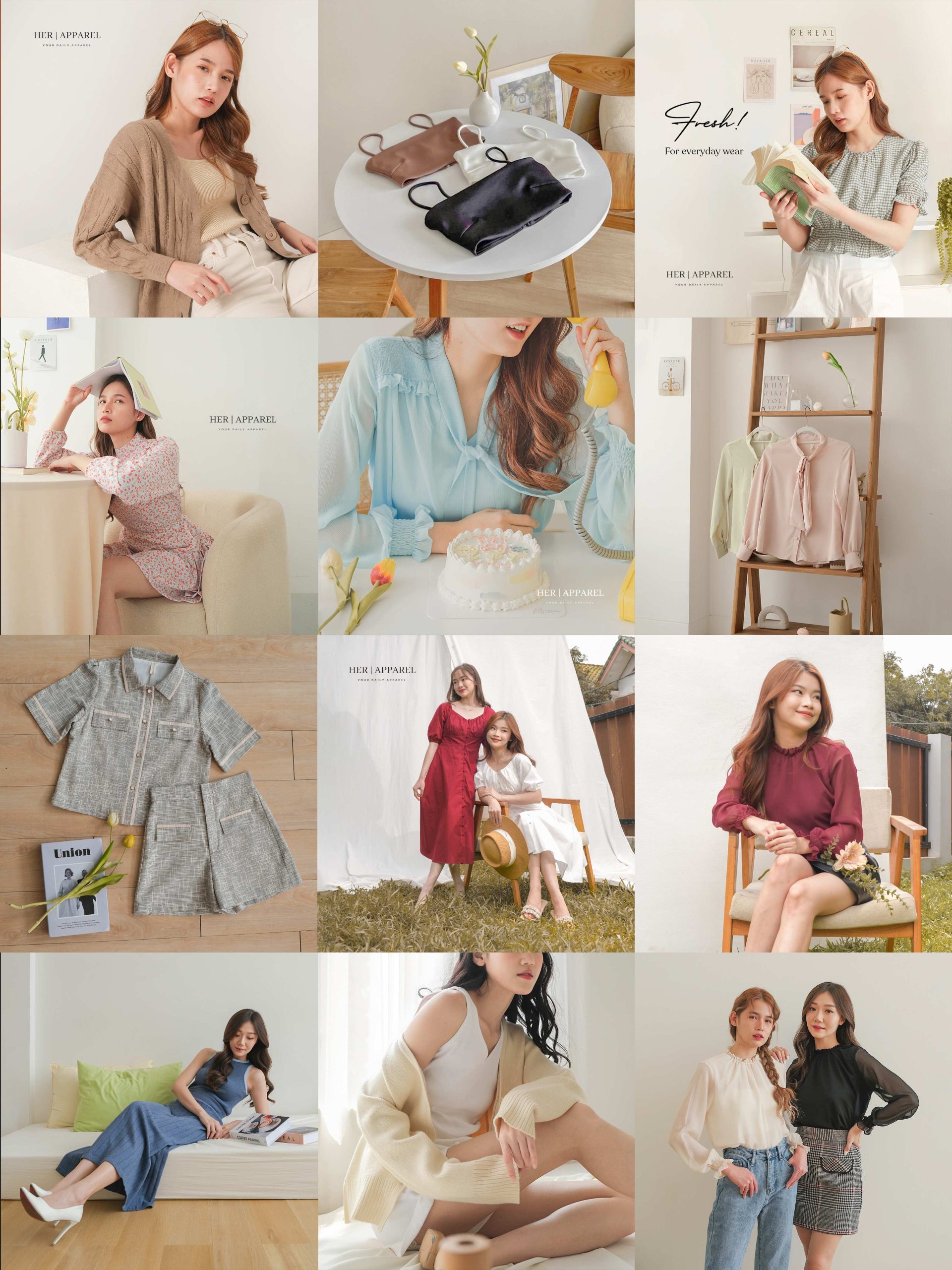
Most brand feeds don't look bad because the photos are bad. They look bad because the photos were never meant to live next to each other. Each one was made in isolation — a single post, optimized for a single moment — and dropped into a grid that has no opinion about itself.
The result is what most feeds actually are: a pile of moments pretending to be a publication. The brand is in there somewhere, but it's lost between the carousels and the product shots and the founder selfies and the random holiday graphic someone made in Canva.
There's a better way, and it's not new. Magazines have been doing it for a hundred years.
The grid is an issue, not a timeline.
When an editor at a magazine puts together an issue, they don't pick stories one at a time and stack them vertically. They think about pacing. They think about which story leads, which one breathes after a heavy feature, which spread gives the reader visual rest. They design the issue as one object.
Your Instagram grid works the same way. Anyone landing on your profile sees the most recent twelve posts in a 3-column layout. That's your issue cover. Those twelve posts are what someone uses to decide whether they want to follow you.
So the question isn't "what do we post this week." It's "what does this week's grid need to feel like" — as a whole, before any single post is made.
Treat your grid the way an editor treats an issue. Every post has a role — hero, supporting, product, narrative. If a post doesn't have a role, it doesn't go in.
Three things that change when you edit a feed like a magazine.
1. You stop chasing the algorithm. You start chasing consistency.
Posting whatever performs best this week — the carousel, the reel, the quote card — gives you short bursts of growth and long stretches of incoherence. The algorithm rewards volume. The reader rewards a point of view.
Editing your feed means you're willing to skip a trend that doesn't fit the issue. It means a slightly less viral post this week is fine if it makes the grid feel right.
2. You plan in shapes, not just topics.
This is the part most social calendars get wrong. The grid isn't a list of topics — it's a sequence of visual shapes. A heavy product shot needs a softer lifestyle frame after it. A bold typography post needs breathing room. A flat color block needs texture somewhere nearby.
When we plan a client's content calendar, the first thing we do is sketch out the grid before we write a single caption. Twelve squares. What's the visual rhythm? Where does the eye rest? Where does it move?
Topics come second. Rhythm comes first.
3. You commit to a visual line — and protect it.
Every issue of a magazine has a visual line: a color palette, a type system, a way of cropping, a photographic tone. The line is what makes the issue feel like one magazine and not a clipping file.
The same goes for your feed. Pick the rules — and protect them.
- One type system. Two faces max.
- One color palette. Five colors, not fifty.
- One photographic tone. Either editorial or product, not both in the same week.
- One crop. Square or portrait. Pick one and live with it.
When a post breaks the line, the grid breaks with it. So the line has to hold — even when the trend du jour is something shinier.
What this looks like in practice.
When we onboard a new SMM client, we don't start with a mood board or a content calendar. We start by deleting. We audit the last thirty posts and strip out anything that doesn't belong to the visual line we're about to define. We archive what doesn't fit. The grid gets cleaner immediately.
Then we define the line: typography rules, color rules, photography rules, layout rules. We write them down. We give them to the team. And we make sure the calendar respects them — week after week, even when it's inconvenient.
Three months in, the feed feels like one publication. Not because every post is perfect, but because every post belongs.

The real shift.
The shift isn't tactical. It's philosophical.
Stop thinking of social media as a channel you broadcast into. Start thinking of it as a publication you edit. The grid is your cover. The captions are your editorial voice. The cadence is your release schedule. The brand is the magazine.
When you edit it that way, the work gets calmer. The posts get sharper. The audience gets a reason to come back — not because you posted, but because the issue is worth opening.
That's the difference between a feed and a publication. And once you see it, you can't unsee it.